Understanding the Basics of Custom Font Creation
Diving Into the Art of Crafting Fonts
There’s something magical about transforming your unique ideas into a tangible, visual form. Creating a custom font isn’t just about drawing letters—it’s like designing the personality of your words. Think of it as giving your sayings their own outfits to wear—sharp, playful, bold, or whispery soft. But where do you even begin?
Start by breaking it down. Every font is a puzzle, and those little details—curves, lines, tails—are your pieces. Do you want your letters to reflect sleek modernity or have a vintage, hand-drawn charm? Picture that “S” with a dramatic curve or an “A” that stands tall with clean angles.
Here’s what to focus on at the start:
- Letter Anatomy: Know the lingo. Serifs, ascenders, descenders—these aren’t just fancy words; they’re the building blocks of your typeface.
- Consistency: A great design flows seamlessly. Your “M” should feel like it belongs in the same family as your “E.”
So, grab a pen, digital tablet, or just your imagination. The world needs fonts that shout loud, speak softly, and everything in between.
Tools and Software for Designing Your Own Font
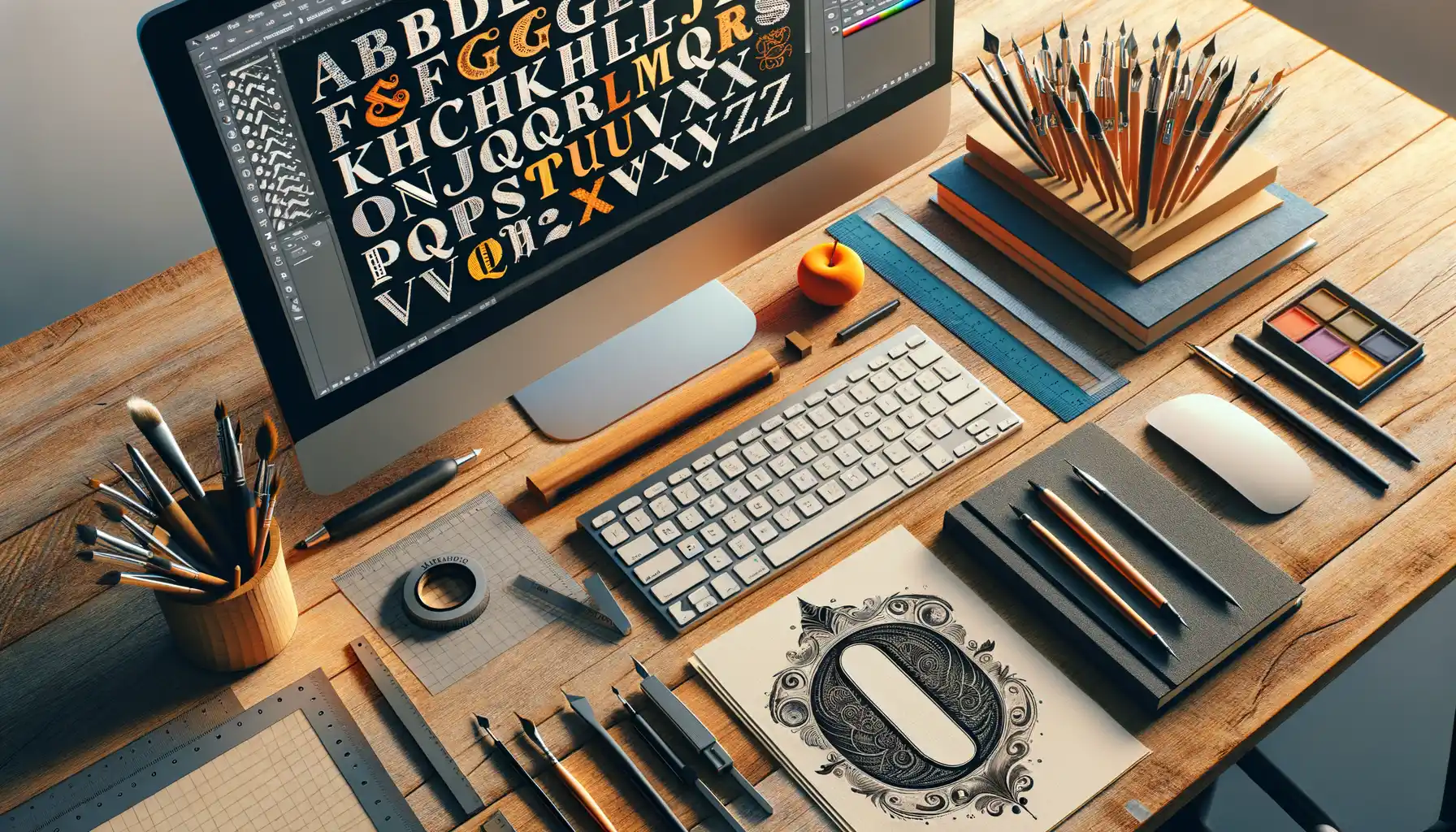
Unleashing Your Creative Arsenal
Designing your own font is like stepping into an artist’s studio equipped with limitless tools. Picking the right software can elevate your creative process from chaotic paint splatters to a masterpiece in no time! Whether you’re a tech wizard, a pen-and-paper enthusiast, or somewhere in between, there’s a tool for every type of creator.
Let’s talk about some heavyweights:
- Glyphs App: Perfect for Mac users who love clean interfaces and powerful features. It’s like having a Swiss Army knife for designing letters.
- FontForge: Free, open-source, and a little quirky. If you’re patient, this tool will feel like piecing together a challenging puzzle—and oh, how satisfying the result!
- Procreate: Yes, you can sketch your ideas on an iPad! Pair it with other software to bring your drawings to life digitally.
From Imagination to Implementation
Here’s the exciting part: there are tools not just for pros but for curious beginners too! For instance, Calligraphr lets you upload your handwriting and transform it into a digital font. Imagine seeing your unique scrawls immortalized as typefaces! Tools like RoboFont might sound intimidating, but their precision is unmatched when it comes to refining each curve and crossbar. Dive in and explore—it might just feel like unlocking hidden superpowers!
Techniques to Design Fonts that Emphasize Conciseness
Shape Letters Like Sculptors Carve Stone
Designing fonts that radiate *conciseness* starts with stripping away the unnecessary—much like a sculptor chisels until only the essence remains. Every letterform should feel intentional, with no frills or distractions to get in the way of delivering meaning.
Consider the balance between negative space and strokes. The empty areas can be just as expressive as the lines themselves, providing breathing room for a clear message. A font designed to emphasize brevity often uses:
- Minimal yet bold strokes to catch attention without overwhelming.
- Simple geometric shapes for harmony and ease of reading.
- Sharp terminals and clean cuts that leave a crisp impression.
While testing, ask yourself: does this letter “speak” quickly? Does its form encourage skimming without sacrificing comprehension?
Think of Fonts as Emotional Messengers
Fonts are not just shapes—they’re carriers of *emotion*. Let’s imagine you’re creating a concise phrase like “Act Now.” A slender sans-serif could signal urgency, while a slightly condensed serif might hint at authority. Details matter: subtle adjustments, such as lowering the crossbar on a capital “E,” can subconsciously soften or heighten energy.
Lose the clutter. Amplify intention. Speak volumes in fewer strokes.
Incorporating Typography into Effective Communication

The Emotional Weight of Typography
Typography is more than just arranging letters; it’s the invisible thread stitching emotion into your words. Imagine someone whispering a heartfelt confession to you in Comic Sans—cringe-worthy, isn’t it? The font you choose has the power to amplify or completely derail your message. Think of it as the tone of your voice in written form. A crisp, geometric font like Futura speaks with modernity and precision; a hand-drawn script? That’s a warm hug from a friend.
- Serif fonts (think Times New Roman): show reliability and tradition.
- Sans-serif fonts (hello Helvetica): exude clarity and simplicity.
- Display fonts: loud, playful rockstars that demand attention.
Aligning Fonts With Your Purpose
Ask yourself: what do you want people to feel when they interact with your text? If you’re crafting concise sayings, this alignment is everything. For example, a bold condensed typeface like Impact makes brief statements hit harder, while a minimalist sans-serif whispers wisdom without overwhelming. Typography is not just visual decoration—it’s your unspoken collaborator. When done thoughtfully, your custom fonts can transform ideas into unforgettable experiences. So, don’t just write; choreograph your words!
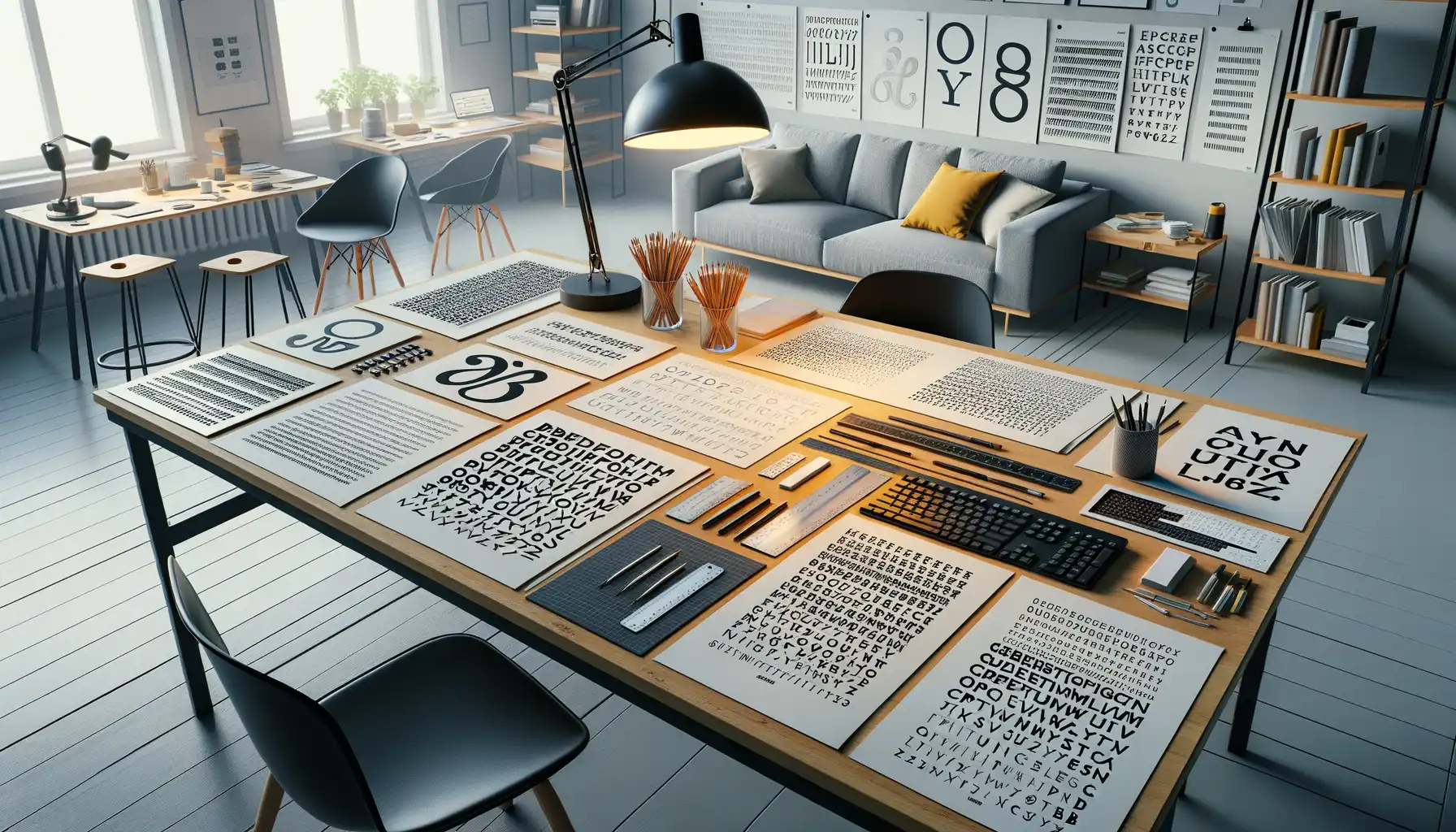
Tips for Testing and Refining Your Custom Font

Bring Your Font to Life: Testing in Real-World Scenarios
Imagine this: your freshly-designed custom font is like a newborn star—it has potential, but it needs some polishing to truly shine. The best way to refine it? Test it in the wild. Take it outside the cozy confines of your design software and see how it performs under pressure.
Start by using your font in *actual* content. Whether it’s crafting mock social media posts, designing headers for a website, or printing out a quote that gives you chills—get tangible. Does the spacing feel right? Are the letters readable when scaled down—or blown up to billboard size? And don’t stop at digital! Print it out. Fonts behave differently on screen versus paper.
Details That Make (or Break) Your Design
Sometimes it’s the tiniest details that transform “pretty good” into “absolutely stunning.” Watch for these common trouble spots:
- Kerning inconsistencies—do letters feel awkwardly far apart in specific combinations?
- Weight alignment—are your strokes balanced across characters?
- Legibility at speed—if someone glances quickly, can they still read the words effortlessly?
Recruit fresh eyes—friends, colleagues, even strangers. They’ll notice flaws your brain has already learned to skip over. Trust me, your masterpiece deserves this care. Your font is meant to move people, so let those final tweaks magnify its message instead of burying it.